App Development
I never learned music theory. And I have discovered since going down this path that most of my fellow guitarists have the same story. I learned chord shapes— never what notes were in a chord and how to get to those notes— and I learned songs. And don’t get me wrong, I loved playing guitar all those years and if you put a chord chart in front of me, I could play along with comfort.
But I never knew my scales, never knew how to solo, never knew what a key was and what chords were in it.
Last year I picked up a ukulele. I wanted one for a while, got some birthday cash, and bought a uke. And then I discovered that there were very few apps for looking up chords for uke. And I, of course, didn’t know how to do it myself. I needed an app. So I decided to build one. Couldn’t be too hard.
I learned how chords work. How they are based on the major and minor scales. A major chord is a formula. The first, third, and fifth notes of the major scale.
This app, Selah Chords, launched late last year and has seen thousands of downloads. Not only does it support uke, but it supports almost anything with strings and frets, from 3-strings up to 7-strings. Add custom tunings or use the built-in ones and it does the work for you in finding dozens of voicings— ways to play a chord— up and down the neck of your instrument.
But that app opened me up to theory. My brain was bubbling. For one, I suddenly understood musical keys. That major scale— take a C major with C, D, E, F, G, A, B— also gave you chords that sounded good together. Specifically— to start with— C major, D minor, E minor, F major, G major, A minor, and B diminished. I got there because of math. Take that, bullies! All of a sudden I could grab an instrument, plug in it’s tuning, and play a chord progression that sounded good. And so I bought a mandolin before launching Selah Chords too.
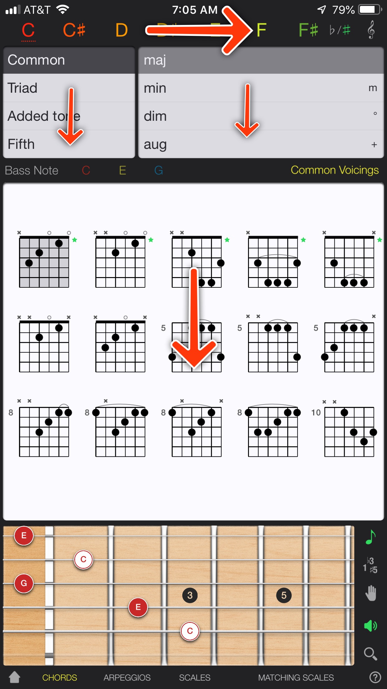
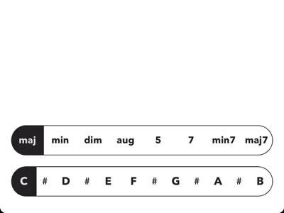
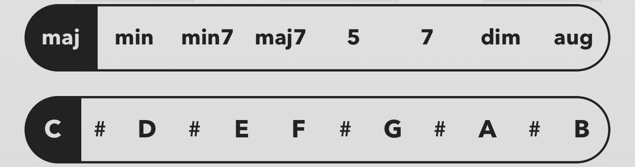
Much of what went into Selah Chords was under the hood. Hidden, below the surface. I could surface chord intervals— look at the expanded chord library view and you’ll see I III V under major chord, I iii V under minor chord, etc.— and surface the notes in a chord under the charts, but I didn’t want to make Selah Chords into a bloated app. Other apps do that. Tuners, scales, arpeggios, chords, and more all shoved into one small interface. Hard to navigate, ugly, and unusable.
So from day one, Selah Chords was the first app. And this weekend I announced the second app. Selah Scales is coming later this year. And I am learning so much more to build this. Last year I struggled when I was told an F# major seventh chord didn’t have an F in it, but an E#. It did because the F# major scale is F#, G#, A#, B, C#, D#, F. The formula for the major seventh chord is I III V VII, so F#, A#, C#, and F. Now, through math and readability, I’ve come to understand that the F should be rendered E#. Having two F’s— one sharp, one natural— in a key is a no-no. I am now understanding why some scales are rendered only with sharps and others only with flats— double sharps and double flats being the primary reason.
Once again, I can only surface a small fraction of what I have built into the engine, but what you will get in Selah Scales will help you grow musically, give you access to scales you may have never known about— especially if my journey is your journey—, and start to help you find the fascinating quirks of theory that I have come to the hard way— math, crazy scribbles on whiteboards, and rambling insanity that my lovely wife has had to put up with.
Permalink
When something that you didn’t get before suddenly clicks.
I was told last year, when working on Selah Chords, that the F# Major 7 chord doesn’t have an F in it, but an E#.
Now if you, like me, blinked twice, you might also be a guitar player. Sorry.
I was told this is because the F# scale doesn’t have an F, but an E#. Still didn’t make sense, but because the individual was smarter than me, I made a complex system to fix this and other odd notes with no understanding of why.
Fast forward to today and I’m building a scales ap— #spoilers. And I rendered the tablature for an F# major scale.
F# G# A# B C# D# F
Well, that looks weird having two Fs…
And so it clicked. And now I better understand the “why” and can build a better system to handle these enharmonic notes.
Permalink
The difference between a half-assed app and a kick-ass app comes down to execution. Many apps try to be too many things at once— hey, have you thought about adding a tuner?— or packing in too many features too quickly. For Selah Chords to have that hand-crafted, well-executed look I wanted, I need to punt features.
When you are building an app, you have to define the MVP— the Minimally Viable Product. What is shippable? But, sometimes during development you reach a point that the product is shippable before you hit what you thought was your MVP. That happened with Selah Chords.
The initial MVP included Custom Tunings. The ability to add, edit, and delete tunings and instruments. Why? Because that is what the engine, the algorithm, was built to do. Give it a set of strings— and a couple parameters— and it would find chords. But once I had the interface for switching chords, scrolling through voicings, and the beautiful themes all in place I realized something. I could just load up a set of default instruments and tunings and ship it. Everything else was ready to ship, but to add Custom Tunings would take another month at least.
So I punted Custom Tunings. It made sense. It was still a very important feature to me, but not for the 1.0. And, as it turned out, not for the 1.1 either. Version 1.1 came with favorite chords, copying chord voicings, drag-n-drop, and banjo support.
You must, when you are building an app, have the goal of shipping. You can always ship an update. Ship early. Ship often.
Permalink
You can turn a bunch of great ideas into a crappy product real fast by trying to do them all at once. You just can’t do everything you want to do and do it well.
Rework by Jason Fried and David Heinemeier Hansson
Half-assed products abound. Sometimes it’s simply a lack of quality. Often it’s something else.
When we think of a product, we usually think of it’s features. How many features? What features? Et cetera. If you haven’t built a product before, let’s do a quick thought experiment.
I tell you that you have two hours to clean the house. You have toddlers. That are home. And awake.
How much got done in that two hours?
Now I tell you that you have two hours to clean the kitchen. Same toddlers. Still awake.
How well did the kitchen get cleaned in each scenario? I bet the kitchen was a lot more clean in the second scenario.
Cut your ambition in half. You’re better off with a kick-ass half than a half-assed whole.
When we pare down our tasks, we do better at accomplishing them.
Same goes with product design. When I started building my chord finder app last year, the feature list was long. The competition had tuners, metronomes, and even song sheets. But those features never once hit my list. Because I couldn’t create a kick-ass chord finder if I was building a tuner. I’d end up with a half-assed chord finder. And a half-assed tuner.
But I did have other features on the list that didn’t ship with version 1.0. They didn’t ship with 1.1 either.
Most of your great ideas won’t seem all that great once you get some perspective, anyway. And if they truly are that fantastic, you can always do them later.
As you build, you will often get to a point that the product is complete. And sometimes it will surprise you. A feature you thought essential wasn’t. A feature you thought wasn’t essential was. If you prioritized your tasks well, you didn’t build the inessential features.
But the beauty is, you can always add them later.
Selah Chords will never have a tuner. That is a different product. Selah Chords is about chords. But coming to Selah Chords early this year is custom tunings, filtering, and more.
I build kick-ass half— not half-assed whole— products. Download Selah Chords today and see what a great, easy-to-use, hand-crafted chord finder can be.
Permalink
Early this year I started playing with an app idea that became Selah Chords. I had a working prototype of the engine that would power it. I knew it could work. But what would differentiate it would be care for UI. Make it easy to do the things that needed to be easy. Instead of focusing on all the other tools that could be added— literally, the competition nearly includes the kitchen sink in their apps— I would focus on doing one thing really well.
A recently (at the time) published article from Michael Flarup had me encouraged to explore skeuomorphic design again, something I had been itching to do for years. To be honest, app design today is too bland. Most of us know that. It used to be full of texture and UI work, parts of the process that would take months. Each app had personality. Then iOS 7 happened. And all that work got thrown aside. Read that article.
I explored a number of paper, notebook, and other interface metaphors for Selah, trying to find a voice that could work. And in the end, I could not find a voice there. And the reason was because I wanted to rely on the screen, not the physical world’s physics.
I had one major interaction that needed to be nailed, in my opinion. Finding a chord. Seems easy, I know. But everyone makes the easy hard, for some reason.
This is a great app. I honestly use it quite a bit, as it supports chords that Selah Chords does not support. But finding a chord in Guitar Gravitas sucks. First, the root note selector is a slider. Second, the selected state is a dotted, 1px tall underline. This thing is horrible.
Then there is the scroll direction change in finding a chord. This app uses multiple panels that all scroll independently. This is not an iOS convention and instantly feels off. Mind you, on iPad, this is better because of the screen size.
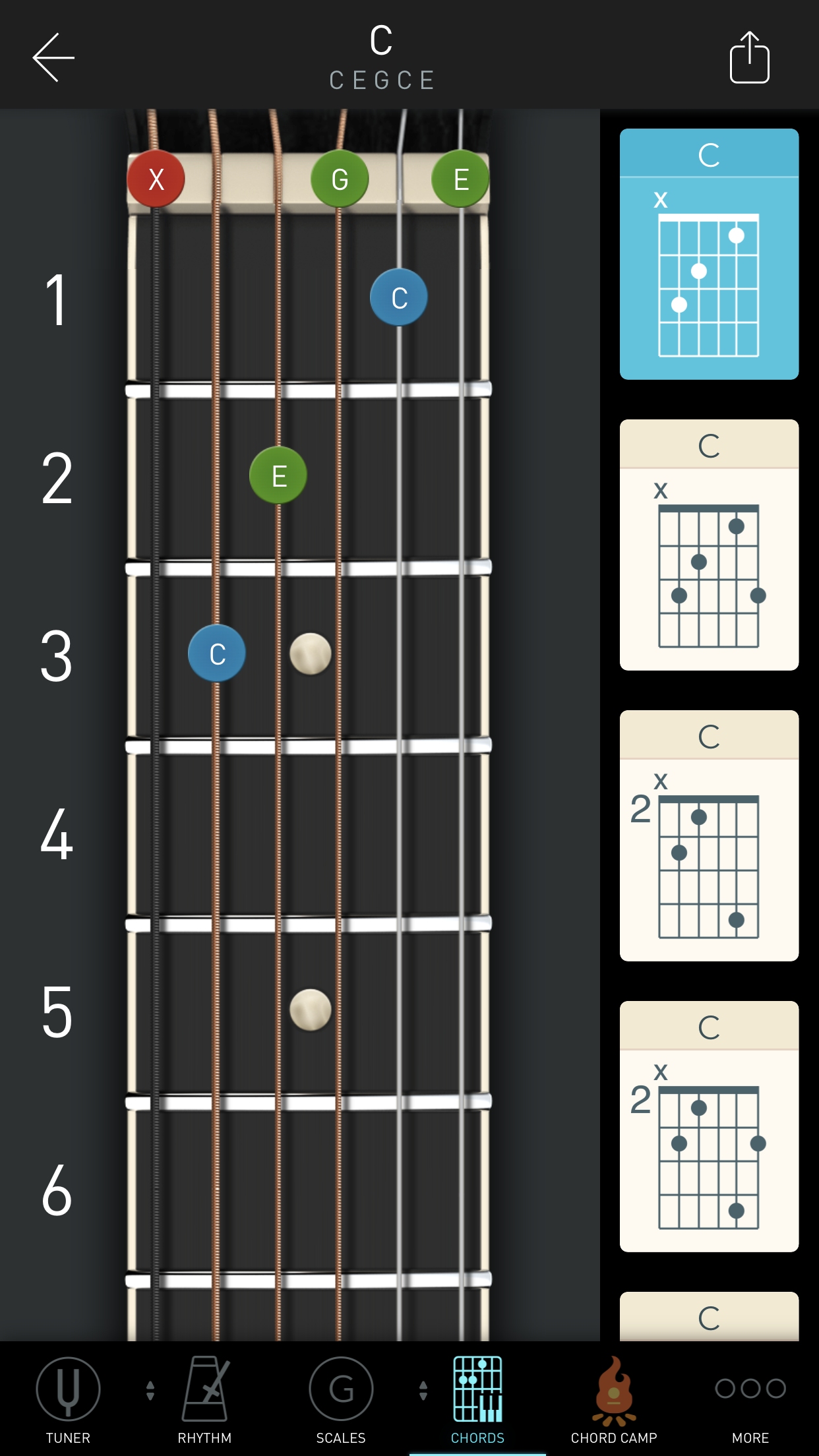
The biggest reason that I use this app regularly, as opposed to others, is because of the chord charts. It shows me tons of voicings without the trouble that other apps make of that.
One of the most popular guitar apps, as it is a tuner— a pretty good one— that also provides other tools. Personally, if you want a good tuner, get Fine Tuner, but that is a different topic. The chord library tool is what we are focusing on here. Once again, sliding lists for root and chord, but made worse by the scroll for voicing. Guitar Tuna only provides a handful of voicings— standard movable shapes, essentially. But to see them, you have to flick one-by-one through them.
I do not use this app much. Mostly because the interface is less than ideal.
Another popular guitar app. Tuner? Check. Metronome? Check. Scales? Yup. And chords. That root note selector is better. All on one screen. No scrolling. But now to select a chord, you have to find it in a scrolling collection view— rows and columns— and expand it.
Wait, don’t tap— damn. It just played the chord. You wanted to see more voicings, didn’t you. Yeah, tap that small expand icon. And now, when the collection would have made since, you get this scrolling list of voicings and a guitar neck that takes up two-thirds of the screen.
Finding my Voice
As I looked to solve this one interaction, Jared Sinclair shipped ’Sodes. And boy. While not skeuomorphic, while super minimalist, it wasn’t boring. It wasn’t bland. Subtle gradients, sparse, well-thought our content layout design. The content was king, not the interface. But even without the interface being king, it didn’t get so far outta the way that you were confused. Buttons had borders. They looked like buttons.
So instead of making beautiful, meticulous textures, I started storyboarding animations. The first test of what I deemed gooey animation was built.
Instead of sharps getting their note name repeated, the sharp extended the preceding note button. The construction under the hood is fun, taking accessibility into consideration with an accessibilityLabel of the full name (“C#”).
And then the sliding selection. Clear selection state was important. At this point I was using Guitar Gravitas and that was my biggest grievance. Animating this allows for a fun, hand-crafted interaction, while not getting in your way. This is done by making the animation quick and informative.
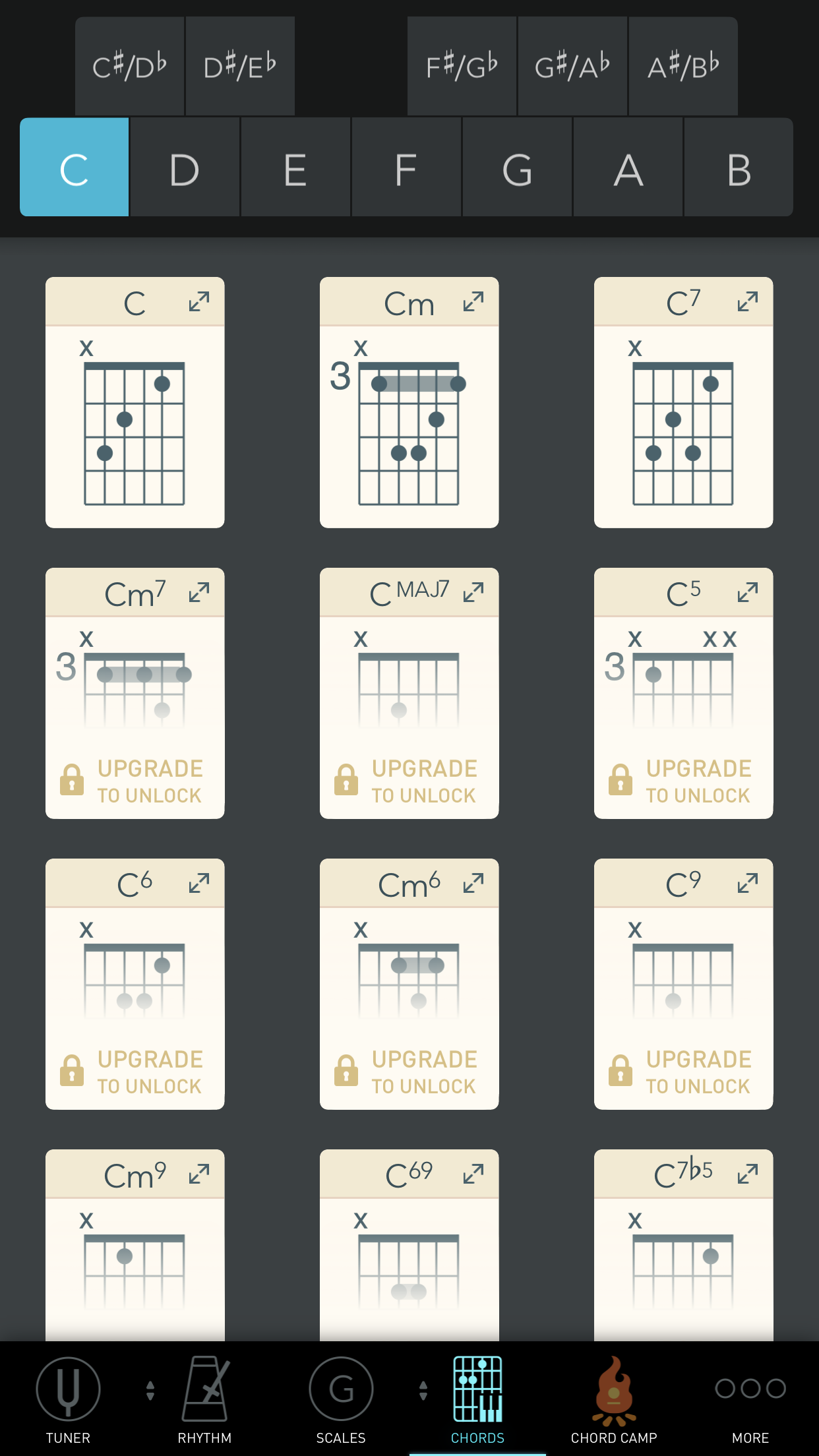
The chord selector is brief. I didn’t need to support a hundred chords. Why? Because the most common chords can be summed down to a handful. I’m not looking to build the only chord finder you use, just your favorite.
Is Skeuomorphic Dead, Then?
I hope not. What I know is that it wasn’t right for Selah Chords. Which surprised me at first. I wanted it to be right. It might be for your app.
What’s Next?
Banjo support is coming. Selah Chords started with guitar, ukulele, mandolin, and dulcimer. I am adding banjo. Also copying or dragging voicings out of Selah Chords is coming. And favorite voicings. And who knows what else.
Get Selah Chords today. It’s free and will become an essential part of your musical toolkit.
Permalink
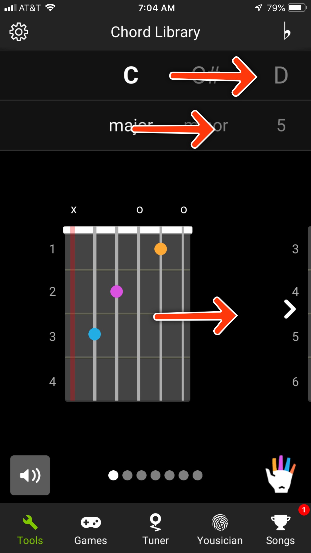
Over the last year I have been learning both ukulele and mandolin, after 20 years of playing guitar. As I tweeted over the weekend, I bought a ukulele and looked for a chord app. I had a couple for guitar, but none of them supported ukulele. I found out pretty quickly that most of the apps suffered from similar issues. They were hard to use— bad UX/UI—, lacked iOS esthetic, and didn't have the features I needed most where they needed to be.
Now so much of that is subjective. Yes. True. When I am looking for a chord voicing, I am looking for where I can play it. The most popular apps show a single voicing at a time.
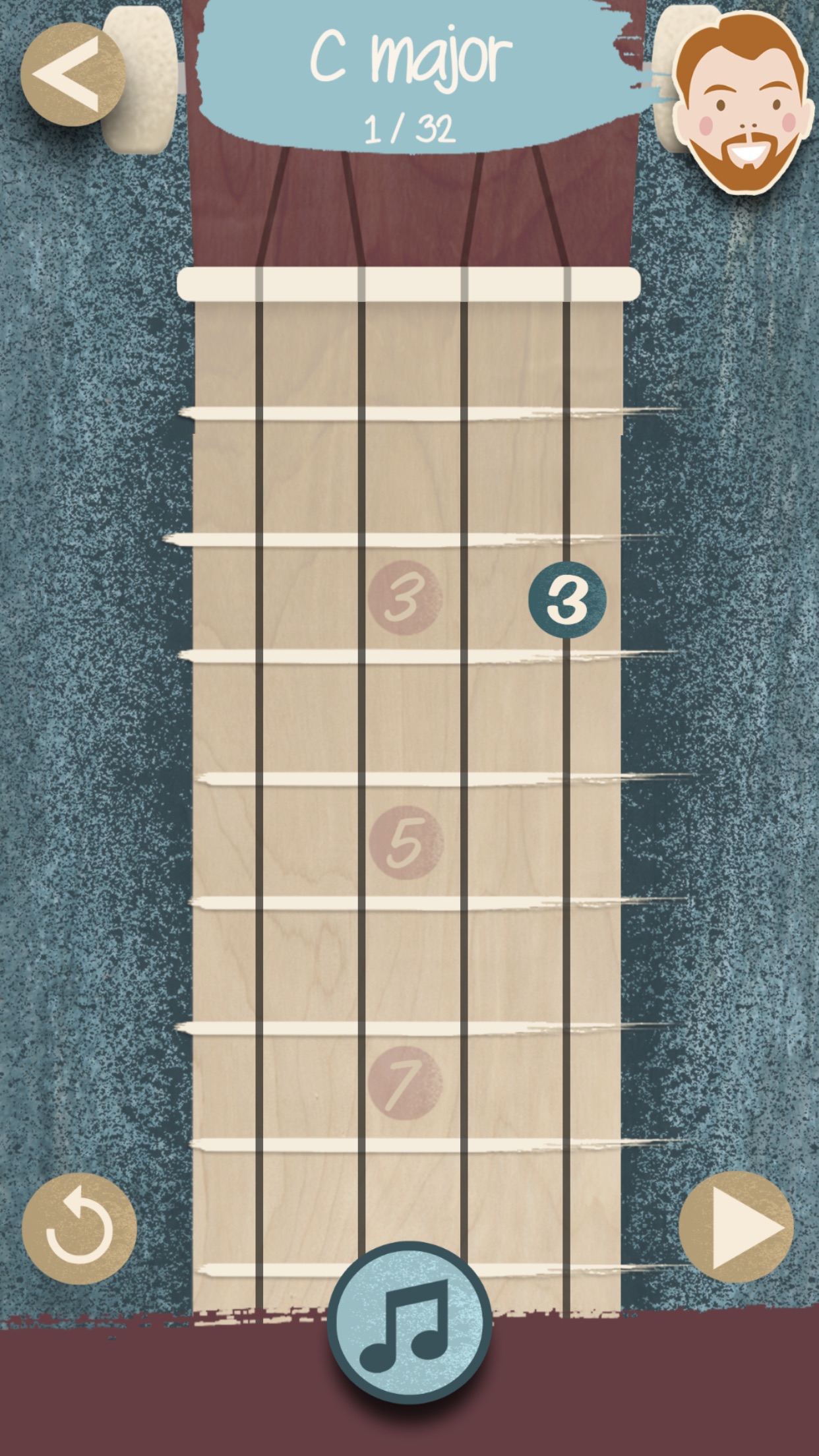
Take this app from The Ukulele Teacher. Are there other voicings? I will guess that the 1/32 up top indicates that there are. But how do I get to them. Swipe right to left? Nope. Maybe that next arrow in the bottom right? Crap! Now it's playing an audio clip of the voicing. Swipe up? There it is! But no scroll indicators, just a change of the fretted notes and the "1/32" changed to "2/32".
Now I want to switch to a D minor. How do I do it? Tap the C major "title" up top? No. The music note at the bottom?
Not the easiest thing to use. And to be hidden away behind an ambiguous button when it is an action I am going to use the most? Not good.
Pulling Back
I have been playing guitar for 20 years and never learned basic music theory. I didn't know how chords were formed, just where they were. Sure, I knew that they were multiple notes being played, but I never cared or concerned myself with which notes aside from my root was being played.
So I started there. How is a C major chord formed? Well, it's based on the C major scale. I didn't know my scales. Or how they were formed. Guess I would start there.
A scale starts with the root note and then takes a certain number of whole and half steps between notes back around. A major scale, for instance goes 1, 1, 0.5, 1, 1, 1, 0.5. That C major scale? C, D, E, F, G, A, B, C.
So back to that C major chord. How is that chord formed? A chord is formed on intervals of a scale. The major chord is using the I, III, and V intervals of major scale. Roman numerals for some reason. There is likely a wiki page for that explanation, if you are interested. So we start at I, which is our C, go to III, our E, and end on V, our G.
To the programmer reading this, you might have noticed that this is math. I certainly did. And math I can do. I love math.
So I Built an App
Looking through the App Store for an app that scratched my itch made me sad. As a UX/UI engineer, I decided that if this was just math, I could design a better looking/working app and build a chord finder that didn't suck. But first I needed an engine. Take that math and turn it into an algorithm. An algorithm that I could hand a set of strings and tell it to find the C major voicings— different ways to play it across the neck of my ukulele.
This was, surprisingly, done on an iPad. I opened Swift Playgrounds and built the first prototype of the algo there. Even had it doing basic drawing of the chord chart.
The algo was straight-forward. Use the above math to find the notes of the requested chord, find all the notes on the set of strings given, then find all possible combinations of those notes on those strings. From there start narrowing it down to actual, playable chords.
It worked, so I started the design process.
Defining the App
What's in and what's out. So I had a powerful algorithm. I could give it 4 strings, and it'd find the voicings of a specific chord. I could give it 5 strings. Six strings. Seven. Ooo. I decided I wanted to support multiple instruments, obviously guitar and ukulele being the top of that list. But as I built the first working prototype app and had it running on my phone, I switched to mandolin strings and went to Guitar Center to play around. See how well it worked and if I could pick up another new instrument. And it was a success. One that went onto me buying a mandolin too.
The app was to stay simple. Prize simplicity, be willing to hold back functionality that other apps may have. No scales, no arpeggios, lots of noes.
So what was required?
A beautiful, clean interface. Easily scroll through a list of chord voicings. Big enough that you could read them comfortably, but small enough that you could see many at once.
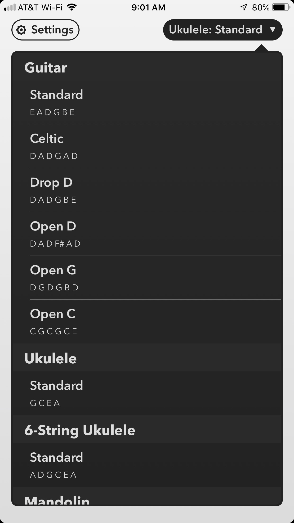
A simple mechanic to switching between chords. That above ukulele app made it very difficult to switch chords. Others do as well. I wanted none of that. So my app would have two bars. Segmented controls. Easily switch between root notes and chords.
Multiple instruments/tunings and easy switching between them. This would be in a drop down. I wanted this to be quick to access, but you wouldn't be switching instruments as often as you switched chords, so a drop down was logical.
Removing Features and Narrowing in on Version One
I wanted banjo support in version one. And the ability to mark a voicing as a favorite. And support for adding custom tunings. But shipping is more important. I shifted from feature building to spit-shine mode in October, realizing that I had a perfectly usable app.
I always remind myself of 37signals's Rework book. Do I want a half-assed whole product or a kick-ass half product? I can ship a dozen features with bugs and no polish or ship a half-dozen features with delight and polish galore.
So I Spent My Year on an App
Like most programmers that decide to pick up a new hobby, instead of learning and mastering ukulele this year, I learned basic music theory, built, and launched an app.
Yeah.
Selah Chords has shipped. And the initial reviews are that it is beautiful, intuitive, easy-to-use, and extremely useful.
And coming soon, banjo and favorite voicings. And after that, custom tunings.
Get it for free today!
Permalink
I went to Agile training last month at Asynchrony. Our department director wanted our team and a few others to go. I agree with almost everything about Agile. It’s easy to, at least for me.
Last week, as I prepped for our team’s next project, I decided that I want to push myself to do as much from my iPad Pro as possible. I have edited many sites from my iPad. But at work, I have been working on a C# website for the last few months. Despite trying, it was much easier to work in an IDE (Visual Studio for Mac Preview) on this site. But our next project is a complete redesign of a marketing site, setting it up on a LAMP box with a PHP-powered CMS.
There is a difference between making quick updates to a site and starting one from scratch. Quick updates typically only require Coda and Web Tools. But starting from scratch sometimes requires more tools. So I started looking at what I needed.
Image Tools is what I came up with. Two new tools coming soon to Web Tools. Easily open an image and use a ruler to measure and a loupe to grab colors.
My typical flow is to jot down a stream of consciousness in iA Writer. Lots of unfiltered thoughts. But this time, I downloaded Trello. I’ve never necessarily hated Trello, but I have a thing about todo list apps. I buy tons of them. Trello just didn’t fit my flow before. But this time it did. I created my Ready, Working On, and Done columns and started adding cards to my Ready column.
Saturday, as I finished my designs, I started working cards through my columns. And crap, I’m starting to like Trello.
Permalink

An Idea
In November I had an idea for an app. For some time I, like many people, have been looking at iOS, namely iPad, and asking if it’s time for me to use it professionally yet. What can it do? What can it not do? What are my real requirements for work? As I explored those questions, I found an area of functionality that no app had satisfied yet that front-end developers require daily: the web inspector.
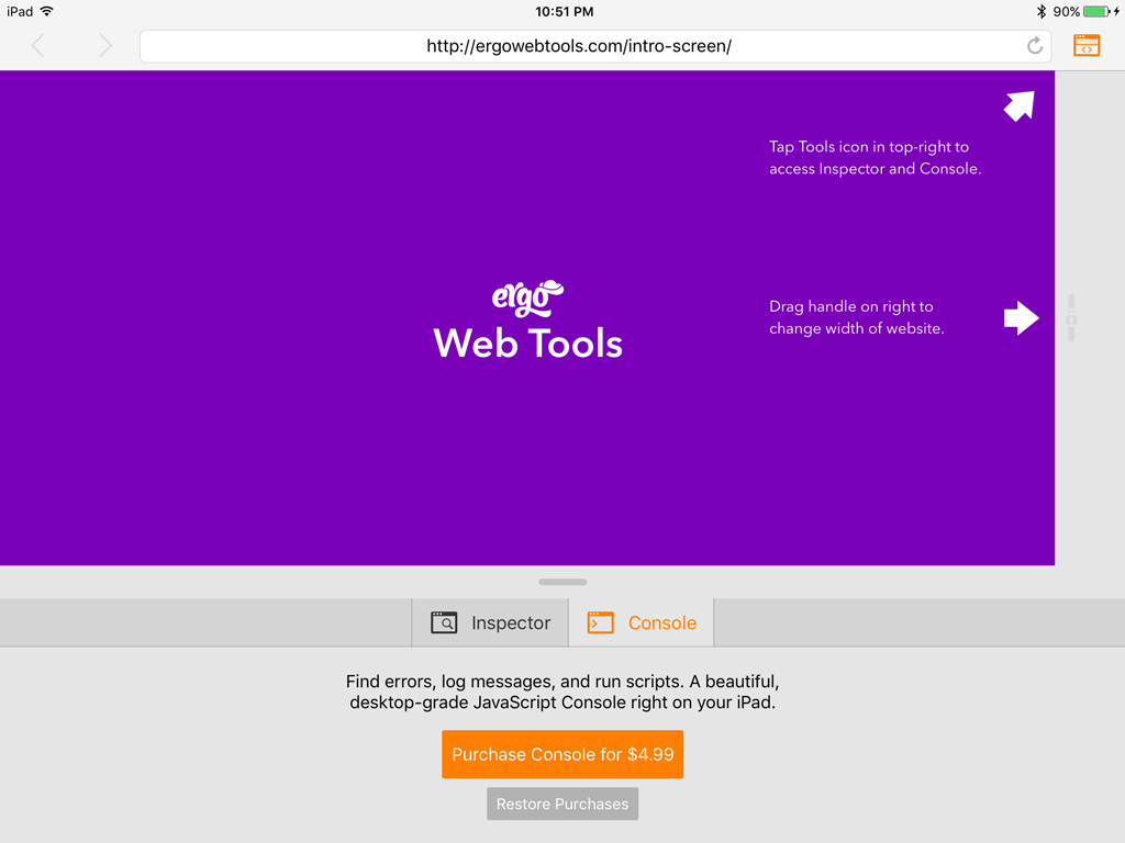
Finding an area unexplored by other apps can be rare and usually means a lack of API support or a huge time investment would be required to build. Neither ended up true. With about two weeks of development (moonlighting-with-a-baby weeks), I had built the first version of Web Tools. Feeling like I had something special, I got a few betas out via TestFlight and launched it in mid-December.
Launch week was met with an article on MacStories and a boom in traffic. In December Web Tools earned me around $1400.
Pro Software for iOS
November marked the release of the iPad Pro, the new addition to the iPad family, differentiated by its much higher memory, storage, and processing power. But what makes it “Pro”? Software. With iOS 9’s new multitasking split-screen and slide-over functionality, it’s starting to feel like you can really get things done on these devices. With better and better API’s for developers to communicate and share data between apps, we can do more and more with the platform. So where’s the software?
As a million articles have covered, the old structure of selling software included two major features: offering a trial and having upgrade pricing. The first allowed one to charge a reasonable price while not scaring off possible customers that couldn’t try before buying, and the second allowed one to make money from current customers. The App Store offers neither of these. Because of this, it’s hard to charge more than $9.99 (or $2.99, really) for an app and actually make sales. Sure, advertising and word-of-mouth can help spread the word that your app is worth it, but that’s an uphill battle. On top of that, there is an expectation among App Store customers that you will continue to pump out updates, bug fixes, and more for years, all for free.
For smaller apps that require less investment of time or can sell large numbers, this can work. $0.99 multiplied by a million is good money. But pro software targets niche markets. There are not millions of potential customers. So high price goes with higher development investment and higher risk.
Making Money on the App Store
How does this work for the App Store, then? The first version of Web Tools had just two features: a scalable web browser and a web inspector. People are already using it every day because nothing like it exists on the platform. As I completed the first version, I realized that much more could be added to this if the market exists. While I could rise the price of the app with every new feature, I would end up with a high priced app that no one will take a risk on because of the lack of trials and I wouldn’t get additional money from my current customers that I’ve worked so hard to get.
So my strategy is in-app purchases. While many games have given them a really bad reputation, they can be used very well too. I have seen many apps use them for try-first methods, such as only giving read access until you upgrade with an IAP.
The structure of Web Tools allows for IAPs to be implemented very easily, as the tool box (that started with just an inspector) is a series of panels and each major panel will come with an in-app purchase, starting with the JavaScript Console coming this month.
But unlike some games, I don’t intend to nickel and dime my customers. The core app will continue to get feature enhancements for free and the Console will continue to get feature enhancements for free to those that buy that panel. I won’t be charging $0.99 for the ability to edit inner HTML in the Inspector. Nope, that one’s on the house.
A Suitable Path Forward
For software to be maintained, the developer must make money. If your business plan misses that step, your app will slowly die as you lack reason for investing time into it. So this is part of my strategy to keep this app alive. If you wish for the app to continue getting updates, please consider supporting it by purchasing the upcoming Console.
Permalink
"Sketch on the Mac costs $99, and we wouldn’t dare ask someone to pay $99 without having seen or tried it first," Omvlee said in a recent interview with The Verge. "So to be sold through the App Store, we would have to dramatically lower the price, and then, since we’re a niche app, we wouldn’t have the volume to make up for it."
The Verge
Lot’s of great points that unfortunately have been repeated over and over in the last 5 years of iPad. If Apple’s intent is for this to replace desktop and laptop computers for many people, developers have to take the risk on the platform.
When the likes of Microsoft, Adobe, and even Apple are releasing software for free on iPad, the bar is set too low for prices. When developers cannot offer a free trial or paid upgrades, the only option is to price super low and make up for the cost in volume. But “pro” apps are typically a niche market. Developers cannot make a living from selling apps for $5.
Permalink
When you live with a device, you learn what works and what doesn’t work. What is needed and what isn’t. For most developers, the iPhone is on them all the time. For many, the iPad isn’t. Because of this, I believe many iPad apps are lacking.
Most iPad apps are just scaled up iPhone apps. Between Auto-Layout, Size Classes, and more, Apple has made it nearly effortless for app developers to make an iPhone app that “just works” on iPad. But this isn’t always pretty. Just look at Twitter on iPad. One column, centered in the middle of the screen. Then look at Tweetbot. A custom two-column layout, tab bar on the left and even some basic keyboard shortcuts.
Developers need to spend time with their medium. Web developers that spend a lot of time on the web get more experience by seeing what others are doing and how. iPhone developers see the latest tricks, trends, and standards by simply using their phones. This same care needs to be applied to iPad. Live with your app and see what works.
Permalink